Some UI trends start off fresh and exciting but quickly become annoying, impractical, or outdated. Here are some of the worst offenders that need to disappear in 2025:
While parallax scrolling can add depth to a website, overusing it can lead to performance issues and distract users from the main content.
Few things are more jarring than landing on a website that immediately plays a video without user consent. This practice can annoy users and lead them to leave the site promptly.
Glassmorphism, characterized by frosted-glass-like elements, can be visually appealing in moderation. However, overusing this effect can result in a cluttered and confusing interface.
Concealing navigation options to achieve a minimalist look can frustrate users who struggle to find essential links. This practice, known as “mystery meat navigation,” hampers usability.
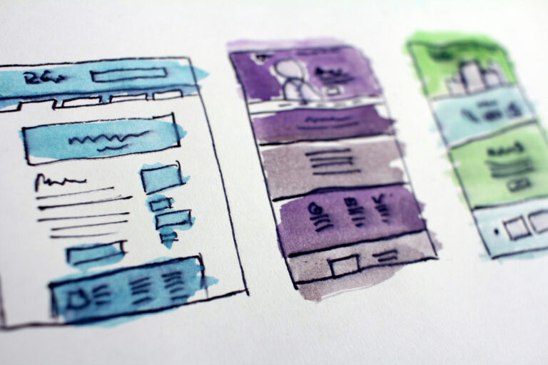
Overloading a webpage with too many elements can overwhelm users, making it difficult for them to focus on what’s important.
In today’s multi-device world, websites that don’t adapt to various screen sizes offer a poor user experience, leading to higher bounce rates.
Using color schemes with insufficient contrast can make content hard to read, especially for users with visual impairments.
8. Complex Navigation Structures
Overly intricate menus can confuse users, making it challenging for them to find the information they seek.
Using too many different fonts or inconsistent text sizes can make a website look unprofessional and hinder readability.
10. Lack of Clear Call-to-Actions (CTAs)
If users can’t easily identify the next steps due to poorly designed or hidden CTAs, conversion rates are likely to suffer. By moving away from these outdated and user-unfriendly trends, we can create web experiences that are both aesthetically pleasing and highly functional.