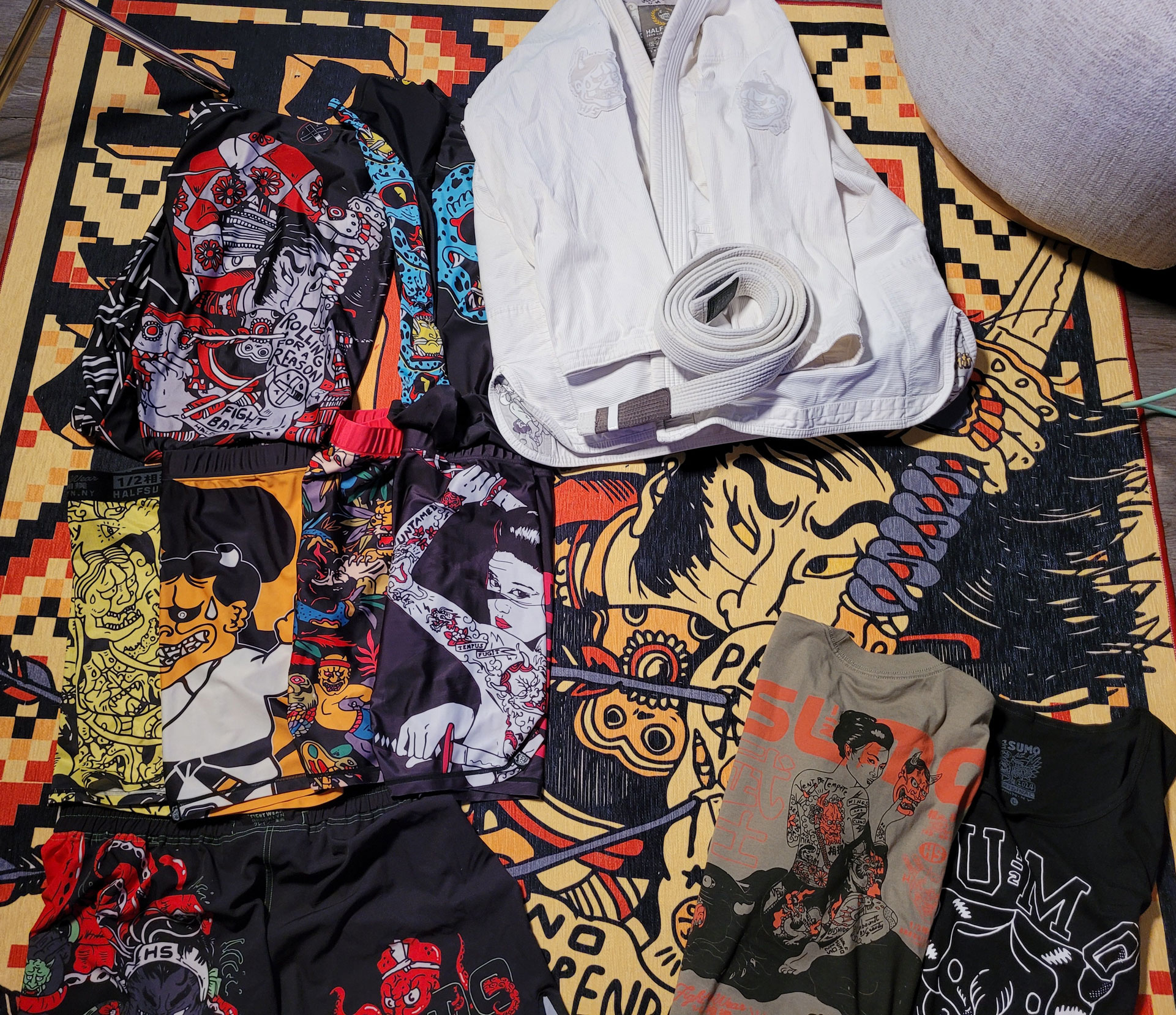
I’m a sucker for good design, and Half Sumo has me completely hooked. Over the past year, I’ve bought more from them than I probably should have. And while their products are solid, it’s not just the gear that’s pulling me in. It’s the design.
I started training Brazilian Jiu Jitsu about a year ago. Like a lot of beginners, I went down a rabbit hole of gear, tips, and communities, and one of those rabbit holes led me to a Reddit thread listing US-based companies that sell BJJ-related apparel and accessories. That’s where I first found Half Sumo.
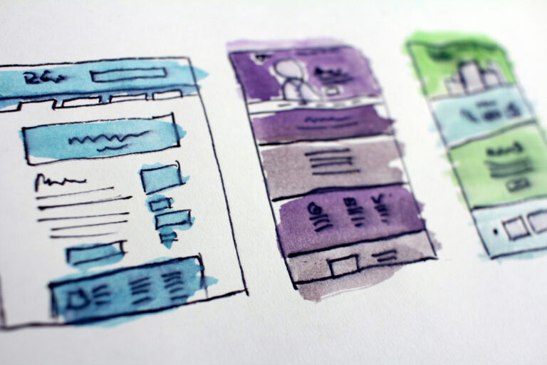
Their site is a Shopify implementation. Nothing too wild under the hood. But the experience? Intentionally built to guide, entice, and convert. They clearly do a fair amount of ad spend, have an active social media presence, and sell through Shopify, which makes them accessible to the growing mobile-first market.
🎨 Brand Identity That Grabs You Immediately
From the first second, you know what kind of brand you’re dealing with. Gritty, witty, confident without being full of itself. It’s not just a logo and some colors: it’s a vibe.
- Textures, typography, and layout all carry the same DNA.
- Product names and descriptions are playful but purposeful.
- There’s just enough visual noise to feel tactile, but never cluttered.
🛒 Clean UX Disguised as Chaos
At first glance, the site feels rebellious. It is not sterile or over-polished. But dig deeper, and you’ll see:
- Navigation is frictionless. You always know where to click.
- Collections are curated smartly. No dead ends or weird category holes.
- Checkout is minimal and lightning fast. Just as it should be.
This balance, between visual edge and user clarity, is a design win. It draws in the curious but serves the decisive.
📦 Product Pages That Don’t Get in the Way
A lot of e-comm sites try to oversell. Half Sumo doesn’t.
- Big visuals. Short copy. Fast info.
- No bloat. No unnecessary widgets or popups.
- You get what you need to know, and you’re invited to scroll a little more.
That restraint is a signal: “We know you’re here to buy. We won’t waste your time.”
💬 A Unified Brand Voice
From product tags to 404 pages, their tone is consistent. It’s playful without being juvenile. Confident without being bro-y. That kind of voice continuity doesn’t happen by accident.
🧠 Good Design is Good Business
This is not about flashy visuals. It’s about clear organization, a cohesive design system, and a strong product line working together to reduce friction and invite interaction.
Half Sumo’s site sells because it’s:
- Well-designed
- Well-organized
- Well-written
And all of that is in service to what matters most: the product.