How to Structure a Website Homepage That Actually Works

the-way

Your homepage is not just a welcome mat. It is your site’s first and best opportunity to guide someone toward working with you. But most homepages are built backwards, packed with trendy design elements and vague messaging that leaves users confused about what to do next.

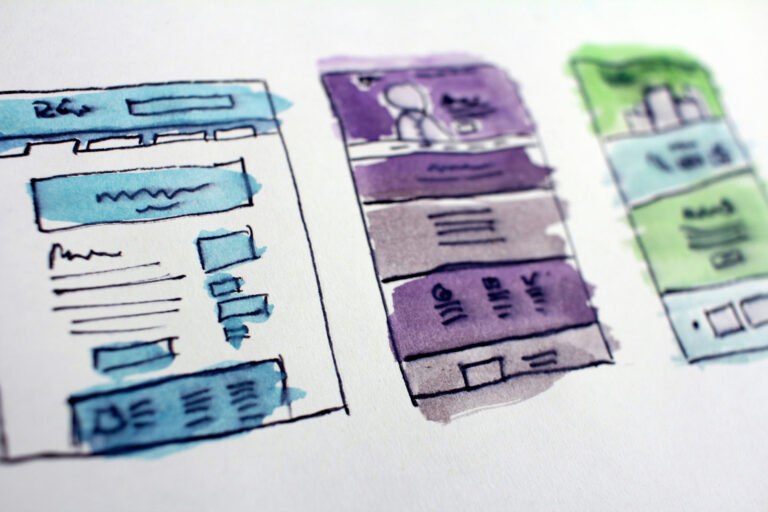
Here’s a simple structure that works well for small business websites and service providers:

1. Headline and Subhead
Clear statement of what you do and who you do it for. Avoid cleverness and focus on clarity. If a visitor cannot understand what you offer in five seconds, they will leave.

2. Call to Action (CTA)
Give the user a next step right away. Whether it is a contact button, a “Get Started” link, or a calendar booking — make it visible and easy to click.

3. Services or Solutions
Brief overview of your main offerings. Use clear language and link to more detailed service pages if needed.

4. Social Proof
Include testimonials, logos of clients you have worked with, or review highlights. This helps build trust early in the visit.

5. About You or Your Approach
Introduce yourself or your team with a focus on what makes your work different. This section is not just about credentials — it is about connection.

6. CTA Again
Reinforce your primary call to action before the user reaches the footer. Don’t make people scroll all the way back up.

7. Footer With Navigation and Contact Info
Keep this simple and functional. It is often a visitor’s last stop before making a decision.

This structure gives your homepage purpose, helping users understand what you do, why it matters, and how to take action.

If your homepage feels cluttered or unclear, start by reviewing the structure. The fix might be simpler than you think.

Book a Discovery Call Today! Submit Your Requirements Today!

Similar Posts

  • Relume.io

    If any designers or devs want to try out Relume at a discount, please use this referral link: The description is a bit of a misnomer. It will “build” a site, but only integrates with Webflow for that functionality. I use it for low-fidelity prototyping and sitemaps. It does export to Figma for further editing,…

  • Typeform

    Hey there. In case anyone is interested, I just completed a feedback form built with this and thought it might be a more elegant UX solution than Google forms for collecting user feedback and conducting user surveys.

  • Accessibility

    A Reddit user asked: ‘I’ve inherited over 100 websites that all need some love in regards to accessibility. How do folks solve this problem at scale? I have looked into a few platforms that provide tools for this, but they are all extremely expensive and charge per domain … In an ideal world, I would’ve…

  • |

    Laws of UX

    Someone on LinkedIn posted about this reference by Jon Yablonski today. These are excellent! We referenced these in a UX program I attended at MICA. It is staggering how many of these there are and how impactful they can be. A long title, but “Universal Principles of UX: 100 Timeless Strategies to Create Positive Interactions…

  • Micro-interactions: The Invisible Workhorses of Great UI/UX

    In the best digital experiences, micro-interactions go unnoticed: until they’re missing. They are the small yet essential design elements that improve usability, guide users, and add personality to interfaces. Whether it’s a satisfying click effect, a smooth transition, or an intuitive progress indicator, these subtle interactions create a polished experience. What Are Micro-interactions? Micro-interactions are…

  • |

    Bad UX Strategy + Implementation Costs More Than a Good Redesign

    A slow, confusing, or frustrating website doesn’t just annoy users, it directly impacts revenue and business growth. Poor user experience (UX) leads to lost sales, higher bounce rates, and frustrated customers who may never return. Real-World Examples of Bad UX Costs: Why Good UX Saves Money Investing in UX upfront improves business outcomes by: Best…