Your Website Isn’t a Billboard: It is a Tour Guide

billboard

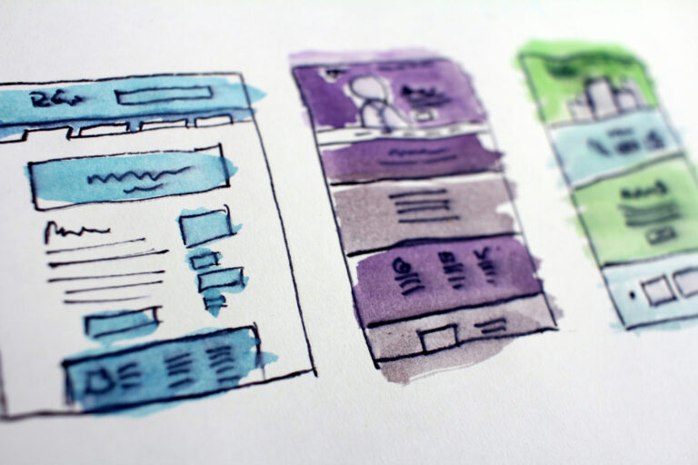
Most small business websites try to impress at first glance. Big images, bold colors, and catchy taglines. But a website’s real job is not to stand there looking pretty. It is to guide visitors through a journey that leads them to take meaningful action.

A well-designed website behaves more like a tour guide than a billboard. It does not just shout for attention. It shows people where to go next and why it matters. That means every section on the page should serve a purpose: answer a question, solve a problem, or direct users toward a goal.

Visitors land on your homepage. What happens next? Do they know where to click? Do they understand what you do and who you do it for? Can they tell what step they should take if they want to work with you?

This is where intentional design matters.

Clear calls to action. Logical structure. Copy that speaks directly to the user’s needs. Layouts that do not confuse or distract. These are not extras. They are the difference between a site that gets results and one that sits unused.

At Tako Mojo, we help clients build sites that feel like helpful conversations. We focus on guiding your visitor through the process, from introduction to contact or sale. And we do it with structure, not guesswork.

If your website feels more like a digital flyer than a trusted guide, let’s talk. There is a better way.

Book a Discovery Call Today! Submit Your Requirements Today!

Similar Posts

  • Relume.io

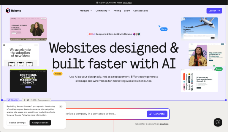
    If any designers or devs want to try out Relume at a discount, please use this referral link: The description is a bit of a misnomer. It will “build” a site, but only integrates with Webflow for that functionality. I use it for low-fidelity prototyping and sitemaps. It does export to Figma for further editing,…

  • Typeform

    Hey there. In case anyone is interested, I just completed a feedback form built with this and thought it might be a more elegant UX solution than Google forms for collecting user feedback and conducting user surveys.

  • Accessibility

    A Reddit user asked: ‘I’ve inherited over 100 websites that all need some love in regards to accessibility. How do folks solve this problem at scale? I have looked into a few platforms that provide tools for this, but they are all extremely expensive and charge per domain … In an ideal world, I would’ve…

  • |

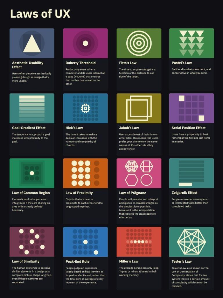
    Laws of UX

    Someone on LinkedIn posted about this reference by Jon Yablonski today. These are excellent! We referenced these in a UX program I attended at MICA. It is staggering how many of these there are and how impactful they can be. A long title, but “Universal Principles of UX: 100 Timeless Strategies to Create Positive Interactions…

  • Micro-interactions: The Invisible Workhorses of Great UI/UX

    In the best digital experiences, micro-interactions go unnoticed: until they’re missing. They are the small yet essential design elements that improve usability, guide users, and add personality to interfaces. Whether it’s a satisfying click effect, a smooth transition, or an intuitive progress indicator, these subtle interactions create a polished experience. What Are Micro-interactions? Micro-interactions are…

  • |

    Bad UX Strategy + Implementation Costs More Than a Good Redesign

    A slow, confusing, or frustrating website doesn’t just annoy users, it directly impacts revenue and business growth. Poor user experience (UX) leads to lost sales, higher bounce rates, and frustrated customers who may never return. Real-World Examples of Bad UX Costs: Why Good UX Saves Money Investing in UX upfront improves business outcomes by: Best…